You Won’t Believe How This Windows Icon Was Made! (1 Shocking Trick)
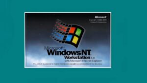
In a recent post, programmer Dave Plummer shared the story behind the iconic Windows NT Start Menu banner, which many users from the ’90s remember fondly. To avoid the complexity of creating unique bitmapped banners for multiple versions and languages, Plummer opted for a dynamic coding approach. He utilized the ability to rotate the device context in Windows NT, allowing him to render vertical text using standard system fonts.
Plummer also recreated the blue-to-black gradient effect seen on Windows NT packaging using standard GDI calls, resulting in a sleek, scalable banner. Despite being new to Windows development at the time, he was excited to discover the possibilities of coding. He acknowledged the lack of graphic designer involvement and focused on translating the Windows 95 design vision into code.
Plummer humorously recalled how users sometimes replaced the banner with custom artwork, including quirky options like “tall, skinny porn.” This nostalgic journey highlights the innovative spirit of software development in the ’90s.

You Won’t Believe How This Windows Icon Was Made! (1 Shocking Trick)
Discover the fascinating story behind the creation of the iconic Windows NT Start Menu banner.
Programmer Dave Plummer reveals the clever coding techniques that brought this visual element to life. Learn how he tackled the challenges of vertical text and dynamic graphics in the ’90s.
Get ready to dive into a nostalgic journey of innovation and creativity in software development!
The Creative Process Behind the NT Start Menu Banner
If you experienced Windows in the ’90s, you likely recall the distinctive Start Menu associated with Windows NT, featuring a prominent vertical banner that displayed “Windows NT Workstation” or similar phrases. Programmer Dave Plummer played a key role in crafting this iconic branding element.
Innovative Coding for the NT Start Menu Banner
In a recent post on X/Twitter, Windows veteran Dave Plummer shared insights into the creation of the memorable Start Menu banner for Windows NT, highlighting his inventive approach and the challenges of software development during that era.
With Windows NT encompassing various versions—such as server and workstation—across multiple languages, creating unique bitmapped banners for each combination would have been cumbersome and resource-heavy. Instead, Plummer chose to dynamically generate the banner text and gradient through code.
While this may seem straightforward today, rendering text vertically posed significant challenges prior to modern web technologies. Fortunately, Windows NT introduced the capability to rotate the device context, a feature absent in Windows 9x. This allowed Plummer to use standard system fonts and rotate the context 90 degrees, resulting in the unique vertical text design.
Recreating NT Box Art with Code
Plummer skillfully replicated the background gradient effect, emulating the blue-to-black transition seen on Windows NT packaging. Using standard GDI calls, he created a gradient that faded from blue to black, with the rest of the background filled in solid black.
The end result was a sleek, scalable banner that accurately reflected the operating system’s distinctive visual style.
Plummer, who was relatively new to Windows development at the time, expressed his excitement about discovering the possibilities: “I’d only been coding for Windows a few months, so it was thrilling to learn it was even possible.”
When asked about the role of graphic designers, Plummer mentioned he didn’t recall their involvement and noted that he effectively translated the Windows 95 designers’ vision into code for NT. He was uncertain whether aligning with the NT box art was his choice or a designer’s but clarified that graphic design was not his forte.
Interestingly, Plummer acknowledged a quirky aspect of this approach: a commenter missed the old trick of swapping the static bitmap with custom artwork. In a humorous response, Plummer noted that users often replaced the banner with “tall, skinny porn” for a personal touch.
Check out TimesWordle.com for all the latest news
You must be logged in to post a comment.